


Let's build a Multi-coloured Card Component using Sass/SCSS
Learn how to build cool Sass/SCSS functionalities.


Hello 👋, In this article, we'll be building a multi-coloured card component with the help of Sass (Syntactically Awesome Style Sheets) awesome features. This article is geared towards implementing some complex Sass feature that may/may not be known to you if you just started learning about Sass.
Prerequisite
- Basic knowledge of HTML
- Basic Knowledge of Sass/SCSS
- Basic knowledge of Terminal
Getting Started
To get started, we'll need a folder created and opened on your favourite IDE (Integrated Development Environment), mine is VSCode with a file index.html also created.
Next off, run the command below into the terminal of your choice to install Sass globally on the PC.
npm install -g sass
If you've installed Sass globally once before now there's no need to run the command again.
Moving on, we'll need Sass installed on the current directory/folder we're working on as a dependencies. Please make sure you run the command below on the project directory/folder.
npm install sass
By running the command above, we should have a folder created node-modules and a package-lock.json file.
Now, we need to run a script, which watches for changes while using Sass. In other to do so, we'll need to run another command on the terminal.
npm init --y
By running the command above, a package.json file will be created. Let's open the file and then navigate to the "scripts" key pair, where the default values there will be changed to the command below:
"script": {
  "start": "sass scss:css --watch"
}
The command above watches all the Sass stylesheet file in the scss folder, (which we haven't created yet) then compiles the Sass stylesheet file into a CSS stylesheet in an auto-generated css folder. That's basically what the command does.
That's all for the setup, so now let's dive right into coding.
HTML
Let's open the index.html file created and then copy-paste the code below into the file.
Don't worry we'll go over the index.html file 😏
<!-- index.html -->

<!DOCTYPE html>
<html lang="en">
  <head>
    <meta charset="UTF-8" />
    <meta name="viewport" content="width=device-width, initial-scale=1.0" />
    <title>Multi-Coloured Card Components</title>
    <link rel="stylesheet" href="./css/style.css" />
  </head>
  <body>
    <main>
      <h1>Multi-coloured Cards with SCSS</h1>

      <div class="container">
        <div class="card">
          <h2>Hello World!</h2>
          <p>
            Lorem ipsum dolor sit amet consectetur adipisicing elit. Suscipit
            facere illo iusto debitis aperiam labore obcaecati harum dicta
            nesciunt quae.
          </p>
        </div>
        <div class="card">
          <h2>Hello World!</h2>
          <p>
            Lorem ipsum dolor sit amet consectetur adipisicing elit. Suscipit
            facere illo iusto debitis aperiam labore obcaecati harum dicta
            nesciunt quae.
          </p>
        </div>
        <div class="card">
          <h2>Hello World!</h2>
          <p>
            Lorem ipsum dolor sit amet consectetur adipisicing elit. Suscipit
            facere illo iusto debitis aperiam labore obcaecati harum dicta
            nesciunt quae.
          </p>
        </div>
        <div class="card">
          <h2>Hello World!</h2>
          <p>
            Lorem ipsum dolor sit amet consectetur adipisicing elit. Suscipit
            facere illo iusto debitis aperiam labore obcaecati harum dicta
            nesciunt quae.
          </p>
        </div>
        <div class="card">
          <h2>Hello World!</h2>
          <p>
            Lorem ipsum dolor sit amet consectetur adipisicing elit. Suscipit
            facere illo iusto debitis aperiam labore obcaecati harum dicta
            nesciunt quae.
          </p>
        </div>
        <div class="card">
          <h2>Hello World!</h2>
          <p>
            Lorem ipsum dolor sit amet consectetur adipisicing elit. Suscipit
            facere illo iusto debitis aperiam labore obcaecati harum dicta
            nesciunt quae.
          </p>
        </div>
      </div>
    </main>
  </body>
</html>
From the HTML snippet above, we can see nothing much is going on. But notice there's a repeated element with the class attribute .card having nested h2 and p elements. That's the component that will be multi-coloured with the help of Sass.
Also, notice there's a link to CSS stylesheet from the css folder, which will be created soon.
<link rel="stylesheet" href="./css/style.css" />
That's all for the HTML file, let's move on to the next section.
Sass/SCSS (Syntactically Awesome Style Sheets)
Here's where the main functionalities will be added but take note this article isn't a beginner fundamental of Sass, so I'll suggest you read this article Write CSS with Superpowers Using Sass. which explains the fundamentals of Sass.
If you're wondering what's with Sass and SCSS (which are two different extensions), I'll suggest you read the article above.
So now, let's create a folder named scss and in it, three files as shown below.
scss
|-- _utilities.scss
|-- _card.scss
|-- style.scss
Notice that both _utilities.scss and _card.scss files have a prefix _ attached to the file names. This signifies that's it a partial file in Sass which wouldn't be compiled until used in the main style.scss file.
If you don't understand anything mentioned above, once again I'll suggest you read this article
Since the scss folder has been created, its time to watch for changes in the scss folder. To do that run the command below:
npm start
Now, we should have an additional folder created - css folder with two files, style.css and style.css.map and the setup should look the image below:
Let's open the style.scss file and then include the code below in the file.
/* style.scss */

@use './card';
From the code above, we making use of the @use rule, which loads the contents from _card.scss file. Notice there's no need to specify the path with the extension, Sass is smart enough to know the extension. All that's needed is the path name to the stylesheet to be loaded.
For now, the _card.scss file is empty, but don't worry we'll be fixing that soon,
Read more on the @use rule here
The _utilities.scss file is where we'll be including some Sass features we'll need to implement a multi-coloured card component.
Firstly, we'll need to create a Map, which is a Sass feature and not available in CSS.
Maps in Sass hold pairs of keys and values and make it easy to look up a value by its corresponding key.
You can think of a Map in Sass like an object in JavaScript but it's symbolized with the parentheses symbol ().
Below is an example of a Map in Sass named $cardBackground:
$cardBackground: (
  '1': rgb(168, 4, 4),
  '2': rgb(30, 30, 155),
  '3': black,
  '4': gold,
  '5': indigo,
  '6': rgb(192, 4, 104)
);
To declare a variable in Sass, the symbol
$must be included, whereas with plain CSS we use--.
From the snippet above, the incremented numbering are the keys (1, 2, 3, 4, 5, 6) then the values are the colours on the left. In this case, we are using the Map to storing colours that will be used in the card components.
Read more about Sass Maps from Sass Documentation
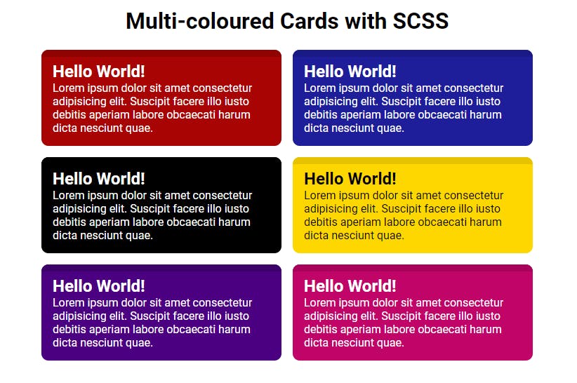
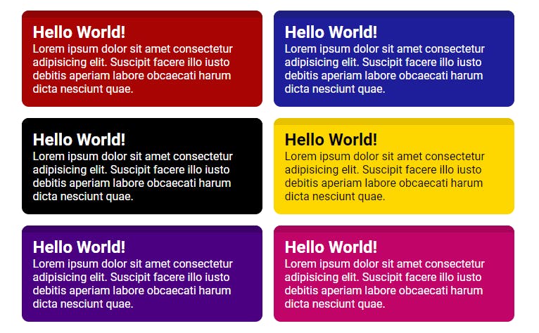
Now, that a Map has been created where the colours will be stored, we also need a way to detect the lightness of colours listed in the Map, to determine what colour should the text be based on the background colour.
From the image above, it's noticeable that the card component with a background Yellow has its text colour as Black whereas the other card components text colour is white.
I know right, that seems unreal. Well, that's where another Sass feature comes into play, which is a colour function - lightness(colour-name).
To access the colour function lightness(colour-name), we'll need a built-in module in Sass, which is the color module. Then, to import the module, we'll make use of the @use rule:
@use "sass:color";
Note, the
@use "sass:color"rule must be called before it's being used. Preferably, placed at the top of the_utitlities.scssfile.The colour function -
lightness()ranges from0%to100%.Read more on the @use rule here
Since, we'll have to use a condition to determine the lightness of the background colour, it's essential we have a function. Yes! Sass also actual functions like other programming languages 😉.
Now, lets go over the function below:
/* _utilities.scss */

/* Set text color based on bg */
@function set-text-color($color) {
  @if (color.lightness($color) > 40%) {
    @return #000;
  } @else {
    @return #fff;
  }
}
Looking at the code above, firstly, we notice the use of the @ rule - (At's rule), which is used to declare a function is Sass. The name of the function is set-text-color and the function has a parameter ($color) - Notice the $ prefix, indicating that it's a variable.
On the next line, an if statement is declared, also with the @ rule, checking if the color.lightness($color) > 40%. If the condition is true, then colour black will be returned - @return #000; else colour white will be returned - @return #fff;.
Read more about
@functionrule here
Okay, so that's all for the text colour functionality, so now we need to set the background colour and also call the Sass function we've declared with the same background colour. To implement this, we'll need another Sass feature named Mixins.
Mixins allow us to define styles that can be re-used throughout your stylesheet, basically and it's similar to Sass functions but doesn't use the @return rule.
Let's go over the code:
/* Set background & text color */
@mixin set-background($color) {
  background-color: $color;
  color: set-text-color($color);
}
Firstly, the mixin is declared using the @mixin rule with its name as set-background and expecting a parameter - $color when used.
Inside the mixin declaration, the background-colorproperty is assigned the value $color which is the parameter variable. Then the color property has its value as the invocation of the Sass function which was initialised earlier - set-text-color($color) with the $color variable passed as the function argument.
If this section isn't clear, please feel free to ask in the comment
Read more about the @mixin rule here
By now, our _utilities.scss stylesheet should look like this:
/* _utilities.scss */

@use "sass:color";

$cardBackground: (
  '1': rgb(168, 4, 4),
  '2': rgb(30, 30, 155),
  '3': black,
  '4': gold,
  '5': indigo,
  '6': rgb(192, 4, 104)
);

/* Set text color based on bg */
@function set-text-color($color) {
  @if (color.lightness($color) > 40%) {
    @return #000;
  } @else {
    @return #fff;
  }
}

/* Set background & text color */
@mixin set-background($color) {
  background-color: $color;
  color: set-text-color($color);
}
So that's all for the _utilities.scss stylesheet file, now it's time we use the utilities created in the _card.scss file. So open up the _card.scss file.
Firstly, we'll need to import the _utilities.scss file with a namespace into the _card.scss file.
Namespace is a name given to a module to access variables, functions, and mixins that has been declared in the module.
utilis the namespace name from the code below:
/*  _card.scss */

@use './utilities' as util;
Read more about @use rule here
Next off, we need a way to loop through the several div elements with the class name card, applying the several colours listed in the Sass Map. To implement this, we'll need yet again, another Sass feature which is the @each rule.
The @each rule makes it easy to emit styles or evaluate code for each element of a list or each pair in a map. It’s great for repetitive styles that only have a few variations between them.
The syntax goes like this for looping through a Map:
@each <key variable>, <value variable> in <map varible>
Let's go the code below:
/*  _card.scss */

@each $key, $value in util.$cardBackground {
  .card:nth-of-type(#{$key}) {
    @include util.set-background($value);
  }

  ...
}
Firstly, the @each rule is declared with two Sass variable $key, $value followed by in, then util.$cardBackground. Notice that the variable $cardBackground which is the Map isn't declared in the _card.scss file but is being imported using the namespace name util.
Then, for each .card selector, we loop through it by the pseudo-class :nth-of-type(n) which takes in an argument. The argument of the card pseudo-class should be each key in the map, whereby it like this:
.card:nth-of-type(#{$key}) {...}
You might wonder, why not .card:nth-of-type($key) and what's with the #{} symbols. Well, we can't use Sass variables on CSS selectors directly except we interpolate it.
Interpolation in Sass is a way of embedding results of Sass expressions, using the symbols #{}. So, that's why the selector has to be written this way: .card:nth-of-type(#{$key}) {...}
Read more on Interpolation here
Next off, we need to include the Mixin we once created in the _utilities.scss file, which set background colours. To do this, we need to make use of the @include rule which only works with Mixins. Also, the mixin - set-background($value) is accessed from the namespace util.
 .card:nth-of-type(#{$key}) {
    @include util.set-background($value);
  }
Notice, the mixin - set-background($value) has the $value variable as its argument which are the values in the Map - $cardBackground.
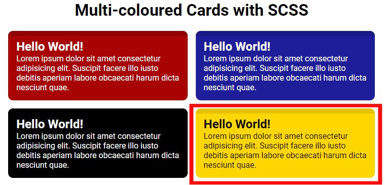
By now, the card components should look like this:
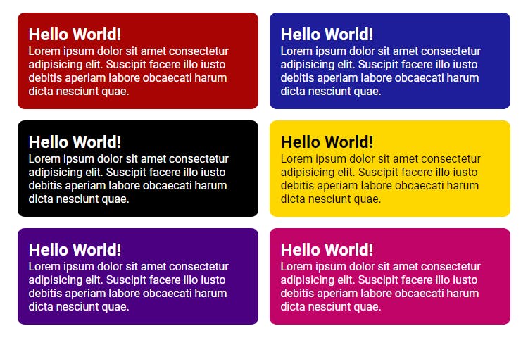
But it looks too plain, isn't it? To make card components have a not so plain background 😂, we're going to add the code below to the @each rule.
@each $key, $value in util.$cardBackground {
  ...

  .card:nth-of-type(#{$key})::before {
    background: color.adjust($value, $blackness: 10%);
  }
}
Firstly, we have .card:nth-of-type(#{$key})::before as the selector with the pseudo element ::before, then the background property has it value as color.adjust($value, $blackness: 10%).
Looking at the value of the background property, it shows that color is used, so it needs to be imported @use "sass:color", which then gives access to the colour function - adust().
The adjust() function takes in lots of argument, but for this use case, it takes only two arguments. The first argument is the colour that should be adjusted which is $value variable from the Map and then the second argument is $blackness: 10% which means darken the colour in the $value variable by 10%.
Read more on the @each rule here
Here's the preview of how it should look like now:
Okay then, let's see the translation for the @each rule in plain CSS:
.card:nth-of-type(1) {
  background-color: #a80404;
  color: #fff;
}

.card:nth-of-type(1)::before {
  background: #8f0404;
}

.card:nth-of-type(2) {
  background-color: #1e1e9b;
  color: #fff;
}

.card:nth-of-type(2)::before {
  background: #1e1e82;
}

.card:nth-of-type(3) {
  background-color: black;
  color: #fff;
}

.card:nth-of-type(3)::before {
  background: black;
}

.card:nth-of-type(4) {
  background-color: gold;
  color: #000;
}

.card:nth-of-type(4)::before {
  background: #e6c200;
}

.card:nth-of-type(5) {
  background-color: indigo;
  color: #fff;
}

.card:nth-of-type(5)::before {
  background: #3c0069;
}

.card:nth-of-type(6) {
  background-color: #c00468;
  color: #fff;
}

.card:nth-of-type(6)::before {
  background: #a7045a;
}
We can see, that each .card selector has a unique background colour and text colour. So, if you'll ever need more than 6 card component, just add more colour to the Map in the _utilities.scss file and Sass does its magic.
Here's the complete _card.scss stylesheet
/*  _card.scss */

@use './utilities' as util;
@use 'sass:color';

* {
  margin: 0;
  padding: 0;
  box-sizing: border-box;
}

body {
  font-family: 'Roboto';
}

h1 {
  font-size: 2em;
  margin: 0.67em 0;
  text-align: center;
}

.container {
  width: 90%;
  max-width: 700px;
  margin: auto;
}

.container > * + * {
  margin-top: 1rem;
}

.card {
  position: relative;
  border-radius: 10px;
  padding: 1rem;
  overflow: hidden;
  max-width: 500px;
}

.card::before {
  content: '';
  display: block;
  position: absolute;
  top: 0;
  left: 0;
  width: 100%;
  height: 10px;
}

@each $key, $value in util.$cardBackground {
  .card:nth-of-type(#{$key}) {
    @include util.set-background($value);
  }

  .card:nth-of-type(#{$key})::before {
    background: color.adjust($value, $blackness: 10%);
  }
}

@media (min-width: 500px) {
  .container {
    display: grid;
    grid-template-columns: 1fr 1fr;
    gap: 1rem;

    > * + * {
      margin-top: 0;
    }
  }
}
Resources
Conclusion
To make this project even more interesting, you could use JavaScript to add input fields, to generate more card components which will then have their individual background colours, but then you'll have to add more colours to the Sass Map.
I hope the article was helpful in a way, Thanks for reading!